Zotero 7 Early Review
I took a family vacation, so I was away from my work laptop when I learned Zotero has launched version 7, a major upgrade. While I enjoyed my vacation, I was naturally eager to get home to try it out!
In my initial review, I found an improved interface design with small changes that improve (instead of interrupt) my workflow, as well as some nice improvements to the PDF Reader (which is now really an Attachment Reader).
I may do a more substantial review as I use Zotero 7 to get stuff done, but my first glance leaves me quite happy with this new version.
Easy to upgrade, and easy on the eyes
Upgrading was easy in Linux – I just used Zotero’s “check for updates” option and upgraded from Zotero 6 to 7. The only thing that “broke” was the application icon, but I just edited my menu to point to the new icon.
On first run, it gave me an option between “Comfortable” and “Compact” layouts. I could toggle between the two to quickly see the differences. I choose Compact, which tightens up the gaps between entries and text. The overall look is clean while still very familiar. (I don’t know about you, but I really can’t stand major interface upgrades, which is a big reason I use Linux – I prefer to keep things stable for years).

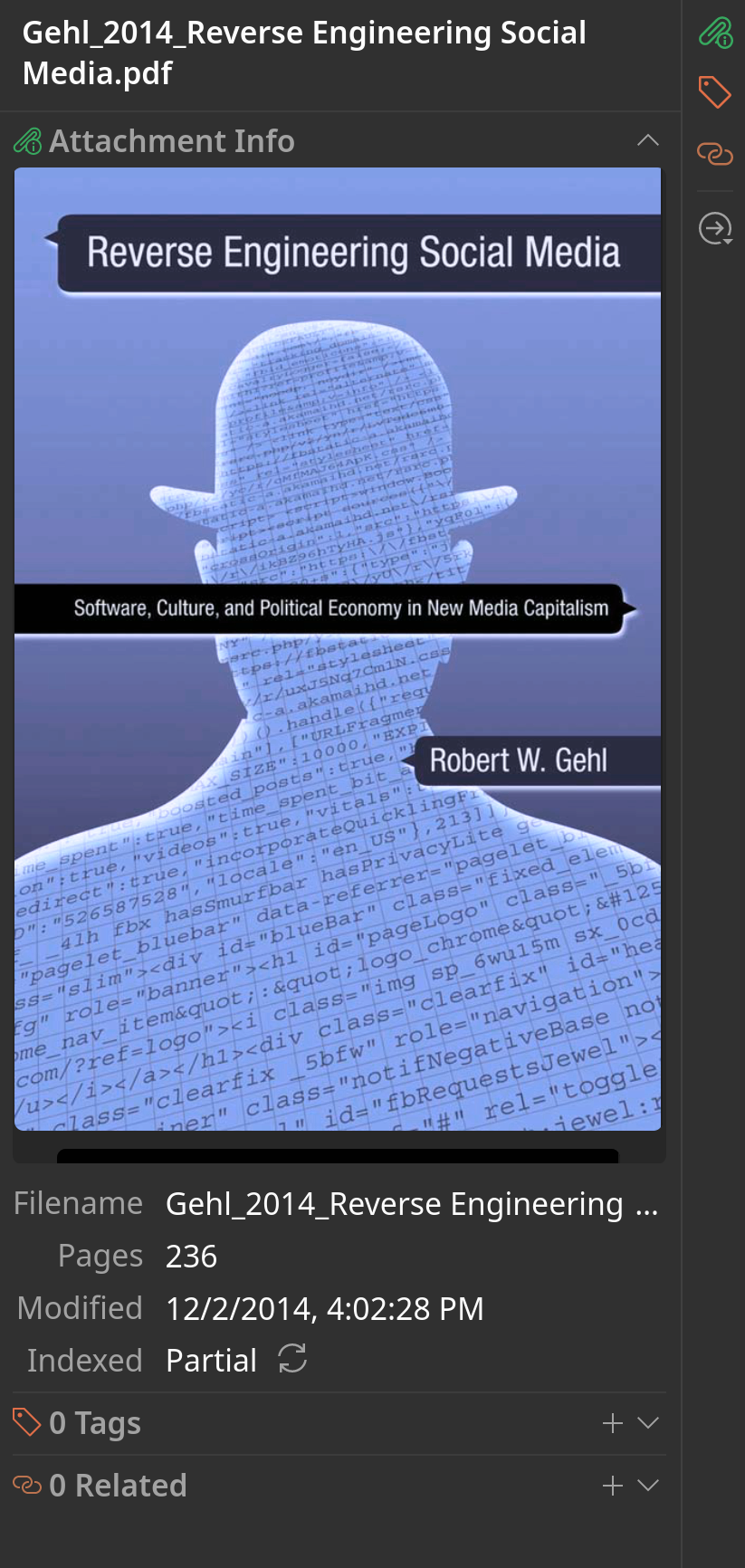
The new Item Preview is particularly attractive. One upshot is that it shows “Related” items in a more visible manner than in past Zotero iterations. I think this could be quite useful. In my experience, relating items really didn’t provide much insight for me. I did it, anyway, on the theory that maybe in the future the data would be useful. Perhaps the time is now?
And a change that is very welcome is dark mode! I had installed a third-party dark mode theme in Zotero 6, so this didn’t jump out at me. That is, until I saw dark mode in PDFs! Amazing! I tried to hack this on my own (and largely failed), but it’s working natively now.
Cool new features
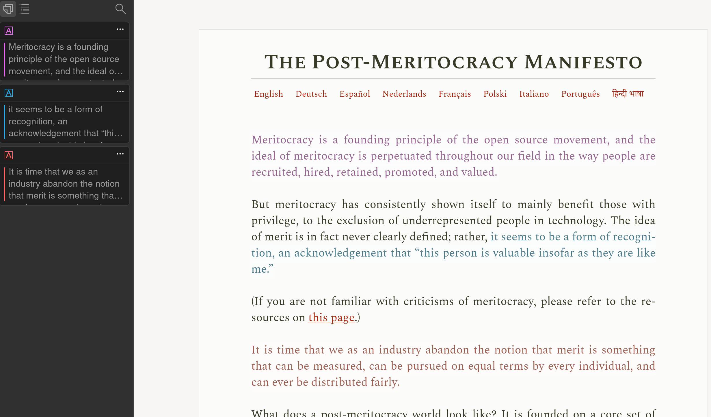
Speaking of PDF annotation, it now includes underlining text in various colors in addition to highlighting. And, either can be converted to the other with just a click. This is a feature I didn’t even know I wanted, but now I think I like it! I can see myself doing underlining instead of highlighting from here on out.
And the PDF reader does a bunch more than load PDFs! It also can handle EPUBs, and – importantly for me – it shows Web snapshots! It’s more of an Attachment Reader now. And those snapshots can be marked up in a similar fashion as PDFs. However, I did see some bugs – in my first test of the snapshot annotation feature, it didn’t show underlines, and it barely showed highlights. I can imagine it’s a tricky matter to code an annotation for heterogeneous HTML and CSS.

In spite of this problem, it’s going to be a useful feature.
Other interface improvements include tab selection with a drop-down. This is a really cool idea, letting me select tabs in a drop-down menu. This might be good for those who use a lot of tabs. I can also search across tabs. So far, it appears to be limited to item titles.
As far as performance goes, Zotero opens at least as fast as before, and it uses 2GB of RAM. It’s clear version 7 is not a downgrade in terms of speed. In fact, PDFs seem to load slightly faster into the reader. I don’t really do benchmarking, but in my experience, their claim that there are performance improvements holds up.
Turning to in-text citation system, I noticed no major changes here, but one subtle one: a way to export the document from one word processor (e.g., LibreOffice) to another (e.g., Word). I don’t know if this will solve the problem of cross-word processor collaboration or not yet.
Features I don’t know if I like – yet
Zotero has redesigned the item pane to include icons, rather than text, as the main navigational tool. This saves space, but it makes things a bit less accessible.
They also changed the icons in the center column after many years of using the same icons. I might get used to picking out the differences between various item types at a glance, but I’m not sure I will get used to it. Fortunately, I can add “Item Type” as a column if need be.
Features I still want to see
There are still features I want to see – stuff I’ve been wanting for years.

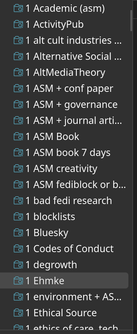
First, I believe it would be great to have the ability to nest smart searches within traditional folders. Right now, the two folder types are traditional, where you create a folder and drag stuff into it, or smart, which dynamically updates based on search criteria. I use the latter almost exclusively, but this results is a long list of smart searches. As you can see from a screenshot, I use a simple fix – I prepend a number to the smart search folder titles to keep similar searches grouped together. I would much prefer to be able to make save these searches together in a top-level folder.
I also remain underwhelmed by the tag management system. It remains a small corner section in the layout. I recall Endnote’s system, which was a separate window with all tags listed alphabetically, making it much easier to scroll through them, delete unwanted tags, and merge tags.
Overall, 7 looks good
Overall, however, 7 looks like a great new edition of the most important software I use to do my FOSS Academic work. 7 appears to be a great addition to the FOSS Academic Lifestyle Dream.

Comments
For each of these posts, I will also post to Mastodon. If you have a fediverse account and reply to my Mastodon post, that shows up as a comment on this blog unless you change your privacy settings to followers-only or DM. Content warnings will work. You can delete your comment by deleting it through Mastodon.
Don't have a fediverse account and you want one? Ask me how! robertwgehl AT protonmail . com
Reply through Fediverse